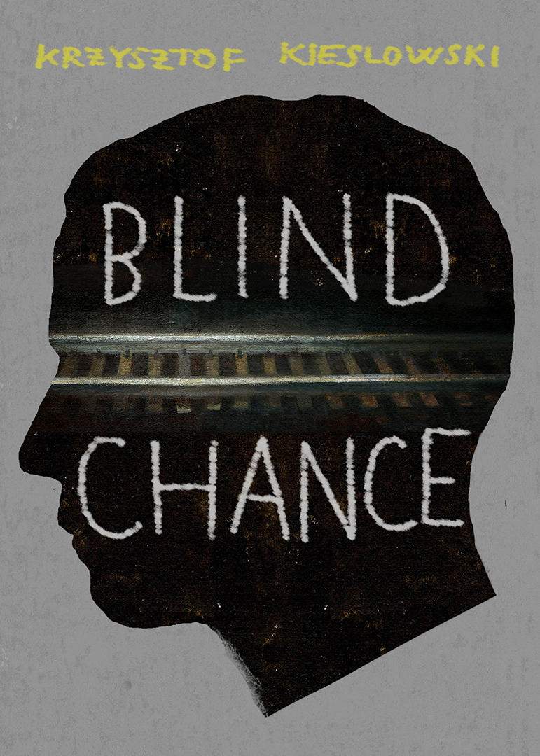
Blind Chance by Gérard DuBois


Krzysztof Kieślowski’s Blind Chance is thematically serious and tonally dark, exploring fundamental questions of human agency with an undercurrent of barely sublimated rage. But structurally it’s very playful, looping back on itself in unexpected and inventive ways. That combination of deep-rooted anger and intellectual trickiness called for an artist with an unusual combination of skills.
Though Gérard DuBois was born in France and now resides in Montreal, his work is in some ways reminiscent of the great Polish posters, combining the kind of high-concept ideas often found in modern editorial illustration with a classical, painterly darkness and a dash of surrealism. We felt confident he could access this Polish film’s cleverness without losing its underlying seriousness of purpose.
Because Gérard is such a strong conceptual thinker, the sketch process here was basically our variation on Top Chef: we gave him a collection of “ingredients”—chance; parallel lives; free will vs. determinism; rage; trains—and asked him to make us an epicurean meal. His sketches, shown here, range from relatively straightforward visual puns to brilliantly absurd constructions. We had many great options to choose from, but the image of the main character’s face, segmented and rearranged by the implication of train tracks and simultaneously facing in three different directions, was our ultimate selection . . . at least in this reality.
This post, inspired by the book Criterion Designs, is a continuation of our efforts to share insights into the collaborative process of creating images for our releases. Eric Skillman is a designer and art director at the Criterion Collection.


